Leveling up a fundraising & e-commerce website
The Client
Boon Supply Co.
Engagement
Role
UX/UI Designer (Solo)

Background
Boon Supply Co. is a fundraising organization that specializes in both large international charities and small youth sports teams alike
Unlike traditional fundraising platform, Boon Supply offers an inventory of premium, eco-friendly goods that fundraisers can sell via the platform as part of a shop.
The company was only two years old and had gained a lot of traction, so it was time for a major makeover fitting of its success. I worked as a freelancer with an agency called Pattern to give the Boon Supply Co. website a complete refresh and re-platforming on Shopify.
Site Overview

Homepage
We wanted the homepage showcase Boon's fun personality while giving users a lay of the land, with attractive entry points into all of the site's many offerings.

Fundraising
It was imperative that we make fundraising easy and accessible, considering Boon catered to both large-scale non-profits and small community organizations alike (e.g. a local children's soccer team).
We broke up the lengthy Start a Fundraiser flow into a friendly, one-step-at-a-time process to make it feel more guided and simple.

To further break up this process and make it more engaging, we send users directly to their new fundraising page to complete setting up photos, videos, and other content.

Users are then taken to their Fundraising Dashboard, where they can track orders and progress, edit their monetary goals, change the duration of the fundraiser, view activity and write updates for their community & contributors.
Shopping a Fundraiser
Shoppers on Boon Supply fall into two categories:
People who come to the site to support a specific fundraiser — usually friends and family of someone involved with a fundraiser
People who come to the site to shop for items, and choose to do it here because they know it will benefit a good cause
We had to ensure our experience supported and fulfilled both of these users' needs.

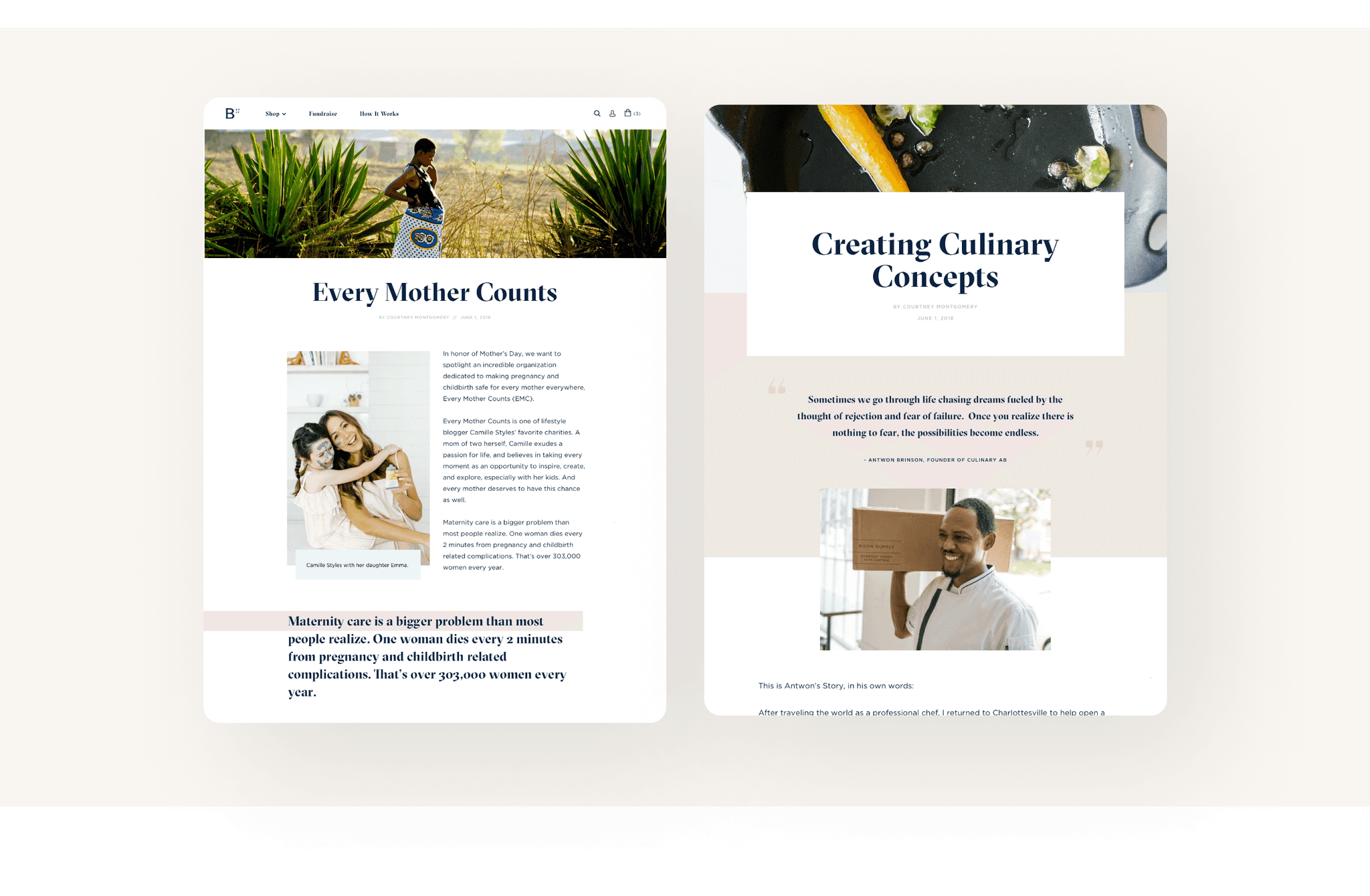
We created templates so that the company could highlight certain fundraisers for their shoppers.
Checkout & Orders
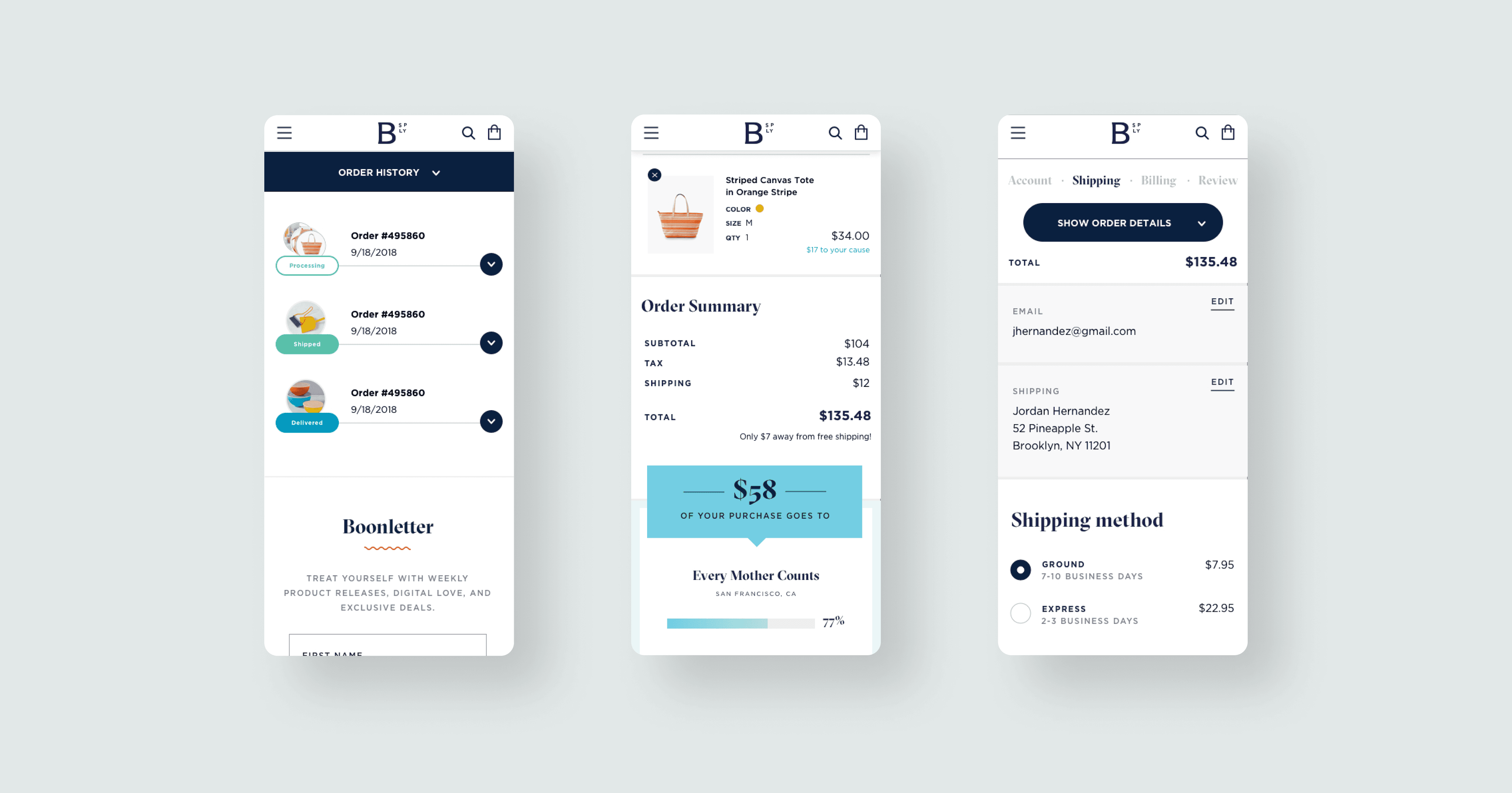
Since the website has functions like any e-commerce site, we of course needed to create experiences for cart, checkout, and order history. We also wanted to give each detail the same visual treatment and personality to match the rest of the site.