Redesigning a product discovery & reviews platform to drive high-quality engagement
The Client
Influenster
Engagement
Product Strategy & Design
February - June 2021
Role
Design & Strategy Lead
Background
Influenster is a product sampling platform with a social component, where people can discover and review products. It leverages user-generated content to provide valuable insights into products while offering brands a way to engage with their target audience through authentic feedback and reviews.
Our Challenge
This base business model allows brands to send out free products to consumers in exchange for product reviews, and had pulled in over 6 million users. After all, people love getting free stuff.
With its early success of high user volume, Influenster had taken a bullish, business-centric approach to building their product, which left some large gaps in vision and functionality.
This resulted in an app that was bloated with underused features and had generally low-quality user engagement and poor customer satisfaction.
Most users were simply there for the free stuff, but even that wasn’t working well. Some highly-engaged, long-time users had still never been given the opportunity to sample products, while a new, unengaged users were selected to participate in a campaign right away.
The Goal
The Influenster team hired us at Bynd to identify and bridge the gaps in the product's vision & functionality, creating a cohesive experiences that offers a consistently rewarding user experience.
The app also needed a major visual refresh.
The Outcome
Our design was quickly embraced by the Influenster community, boosting both engagement and product adoption.
The beta was rolled out to just 1% of the app's users, but spread rapidly via word-of-mouth across social and message board platforms. The beta version saw a 39% increase in users, a 49% rise in user satisfaction (NPS), and +.9% in referrals.
Product Overview
Influenster is a fairly complex product, so it's helpful to provide a quick overview of its features
Profile-Building
Users answer questions about themselves to build a profile, which allows Influenster's partners to target them for product samples relevant to their persona.
Product Reviewing
Users can write and read reviews on a wide range of products, from beauty and skincare to food and electronics.
Campaigns
Influenster sends out free products, called Campaigns, to select users in exchange for honest reviews on Influenster, the users' social media accounts, and external websites.
Social Networking & Community
Users can follow eachother, and their activity on the app — product reviews, questions they ask and answers they author appears in others' feeds.
Badges & Rewards
Users earn badges and rewards based on their activity and influence on the platform. Higher engagement can increase the chances of receiving more VoxBoxes.
Foundational Strategy
Our team started by learning about our users so that we could identify their needs, motivations, and behavior with the app. This process helped up build a foundation from which we could make informed decisions and hypotheses.
Jobs to be done
To account for all features and interactions, we investigated every task a user must be able to do on the current app and mapped them out.

Love & Usage
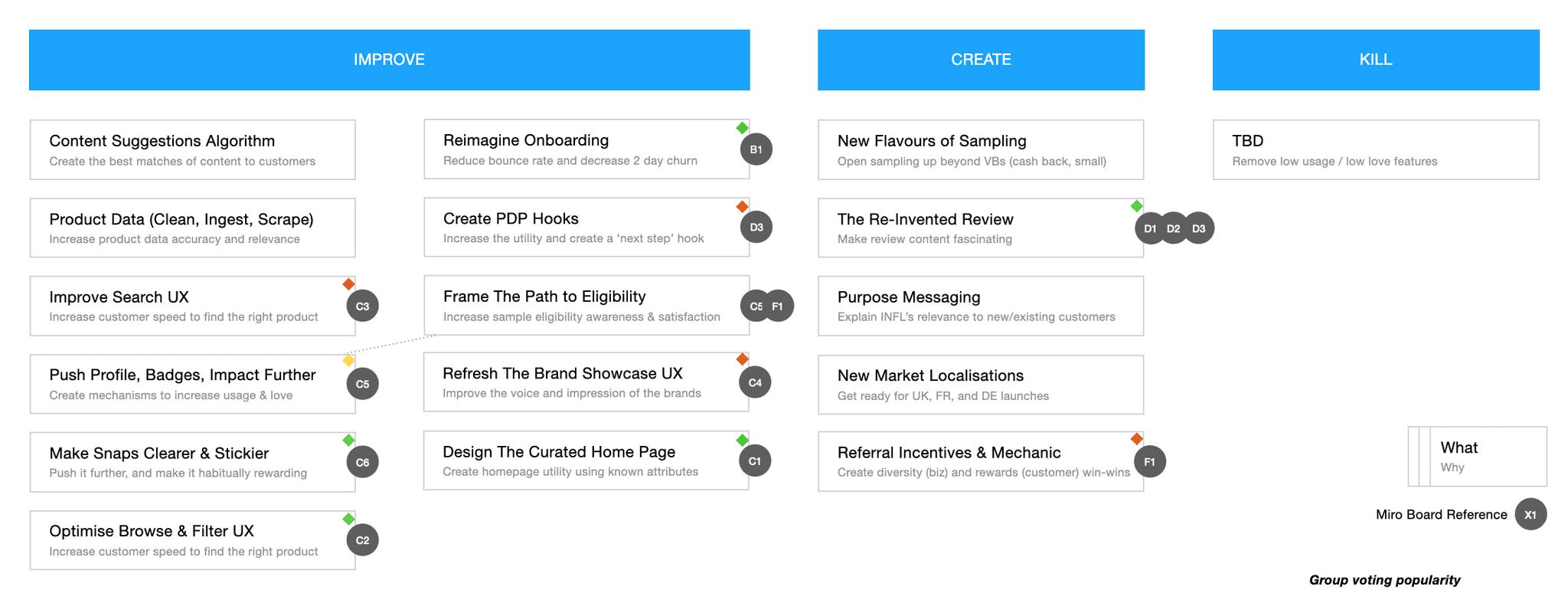
To focus on what would make the highest impact, we looked at which features were used the most, which were loved the most, and what was missing. This allowed us to sort features into three categories: Improve, Create, and Kill.
Redesign
Onboarding
One of Influenster's key mechanisms is gathering rich data about users — everything from their skin texture to their niche hobbies, to what they eat for lunch — so that their B2B clients could target specific users with free products that would be relevant to them.
The previous process for profile building took place exclusively during Onboarding, where users were immediately hit with hundreds of tedious, seemingly unending and boring questions about themselves. It also led to a dead end — landing users on their User Profile without re-engaging them.

A map of the onboarding flow as it was
We saw an opportunity to make the onboarding process engaging and fun via gamifying the UI, reducing mental labor by changing the way we ask questions, and turning it into a gradual process.
First, we analyzed all of the questions, and were able to drastically condense them into fewer questions that would provide Influenster's B2B clients with essentially the same valuable information they need to know about a user. With the use of an AI tool, we were able to further condense the amount of questions we asked to just 5 — enough to land users on a personalized Home screen.
We also changed the way we ask and allow users to answer these questions. So, what once had felt like a questionnaire you fill out at the doctor's office became something that felt more like taking a Buzzfeed quiz.

Home / Feed

Beyond the rewards section, users receive a feed featuring content that targets their interests.
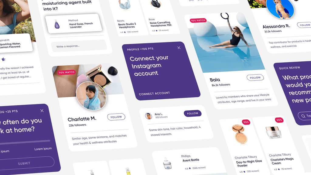
We approached the Home Feed design by creating a set of multi-purpose "cards" that fit a wide array of content while ensuring everything looks visually cohesive.

Our card system achieves the following objectives:
Increase social engagement by connecting users to each other
Reward high-quality user-generated content by spotlighting it on the app
Boost brand & product awareness for Influenster’s B2B partners
Encourage users to generate more content by showing them products they have likely used and prompting them to review products in a quick, easy, and more enticing way
Gather more data about users to better personalize their experience and allow Influenster’s B2B partners better target who they send free products to


Instead of tasking users to randomly think of products to review, we instead prompt them throughout the app experience with more specific, friendly questions that will trigger them to think about the items they use. We then offer an easy pathway to write a product review on the spot.
Product Detail Pages
Redesigning the Product Detail Pages (PDPs) provided another great opportunity to tackle some of the app's biggest challenges.
Users tended to interact with Influenster in a transactional way: Perform a task (write a review, answer a question) to get free products. We wanted the app to be a place people could turn to for high-quality, honest reviews and discovering new products.
Users weren't rewarded for generating quality content, thus PDPs offered little value to users, who knew most reviews were not very inspired. They could get better feedback about a product by going to an ecommerce website.

We designed a new PDP that would leverage the untapped power of how much we knew about users to create an exceptionally personalized experience.
Instead of creating something that looked like a product page you'd see on any e-commerce space, our PDP centers reviewing, personalization, and social features.
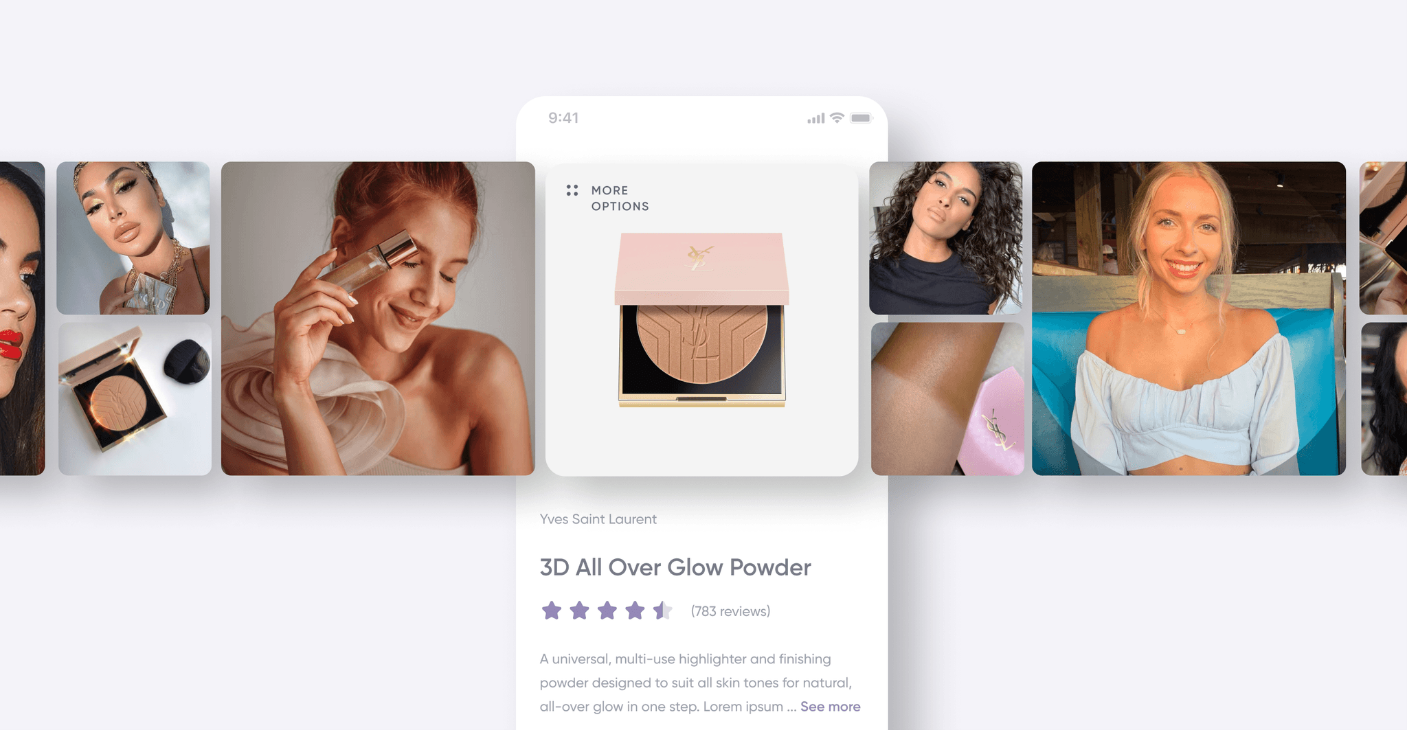
The PDP features user-generated photos alongside the main product image, pushing a community-centric experience that is that further rewards users for submitting content.
For each product, users see a personalized "match score," which is calculated by comparing their self-reported personal attributes with those of the people who've reviewed the product. If people who have a lot in common with them have rated the product highly, the score will be higher.

At a glance, users can see which types of people rated a product a certain way — this can include relevant data like whether or not the highest ratings came from parents of young kids, people with certain hair and skin types, or people who live in urban vs. rural environments.
This data is automatically pulled from the profile-building mechanisms the app already uses to provide data to its B2B partners.
The categories displayed for "Who it's great for" are relevant to the product's category. In the instance of a makeup product (as shown here), the app pulls out categories like skintone, age group, and make-up skill-level. On a health tracker device, the module would instead show categories that reflect the reviewers' fitness level and which types of sports and activities they do.

The reviews themselves are additionally personalized — the first reviews users see on the screen are the ones left by people who are most like them in categories relevant to the product type.
This alleviates someone from having to scroll through thousands of reviews wondering “okay, but will this work for someone like me?”
Similar to the match score users get with each product, users see a match score with other each person who reviewed the product. This ensures they understand that they are seeing the most personally-relevant reviews first.
Product Reviewing
Influenster's ecosystem relies heavily on product reviewing, and our goals for this feature were clear — build something that fosters an abundance of high-quality, media-heavy product reviews.
It would have to feel accessible, easy, fun, and encouraging for users in order to achieve that goal.

The first thing we thought about were the entry points into product reviewing. The existing app had two entry points:
A CTA on each Product Detail Page where users could write a review for the displayed product
A feature called "Snaps" which sent users down a tedious, neverending wormhole where it spiraled them through every possible product category asking them to select brands and then products within those brands that they've used, and then asking them to review each product one-by-one on the spot (it felt about as exhausting as the sentence you just read)
We added an entry point on the Home Feed (as shown above in the Home Feed section) to prompt reviewing, and did a major redesign of the Snaps feature, renaming it "Quick Review."
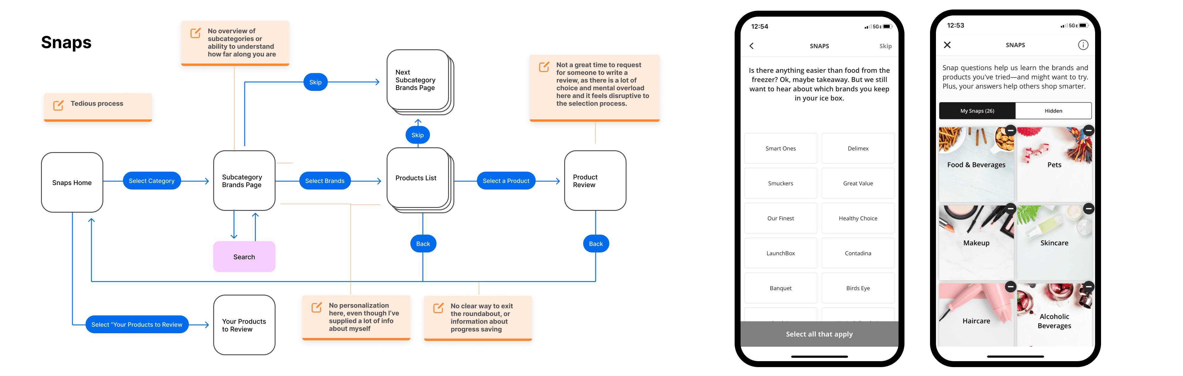
The former "Snaps" flow, and some screenshots of the feature before redesign
The Quick Review (FKA Snaps) feature is immediately personalized. Instead of clicking on a category and seeing a generic list of brands to choose from, we leverage what we know about users to show them a short list of curated brands they have likely used products from.

For the review process itself, we took inspiration from products like Airbnb to build a progressive experience.
By asking for one thing at a time — and rewarding them with points at each step — our review experience avoids landing users on a screen with an overwhelming amount of inputs.

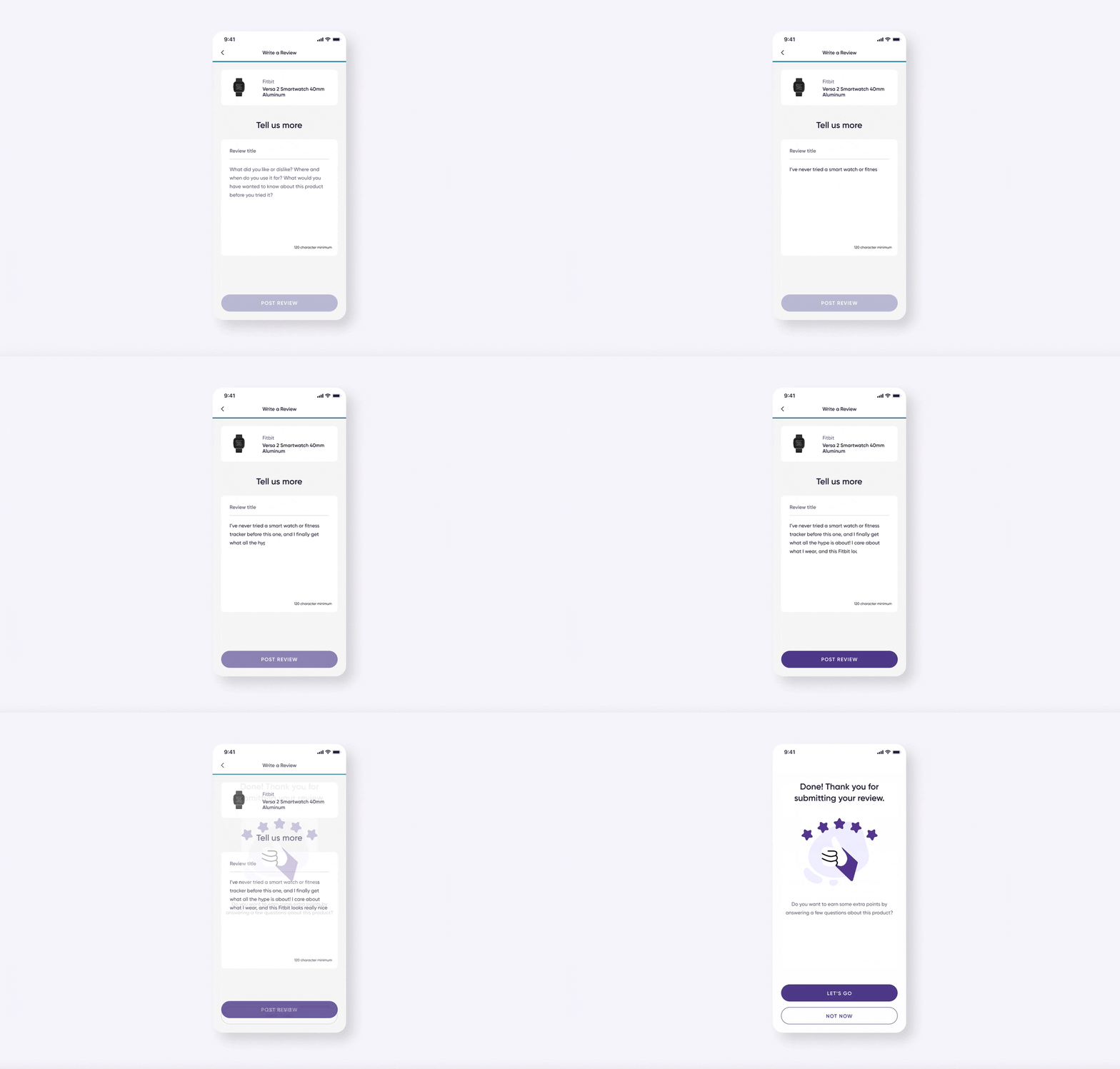
After users complete a standard review — rating, adding media (optionally), and writing a review, they are asked if they'd like to answer a few more questions.

These additional questions are specific to the product category and directly feed the "What we love about it" module on the PDPs. This small interaction can power endless opportunities for Influenster to become an industry leader in product recommendations & discovery, and even editorial content.
We award users with points to encourage them to participate in this post-review experience.
Samples & Campaigns

The former "Start a Campaign" feature flow
The "Start a Campaign" feature had a host of issues. It was deceptively-named (users cannot "start" a campaign but are instead selected to participate in one), tedious, riddled with "dead ends" (places that halt engagement), confusing and generally inconsiderate of its user's time and convenience.
It was also an uninteresting place, as the majority of users don't have an active campaign at any given time.

Improving this experience required Influenster to change some of the ways it handles campaigns, which they were ready and willing to do.
For one, we had to ensure users are indeed rewarded for their activity on the app — that they are more likely to be selected for a campaign by leaving reviews about products they've used, interacting with the community, etc.
Next, that users are able to interact with upcoming campaigns and express interest in participating.
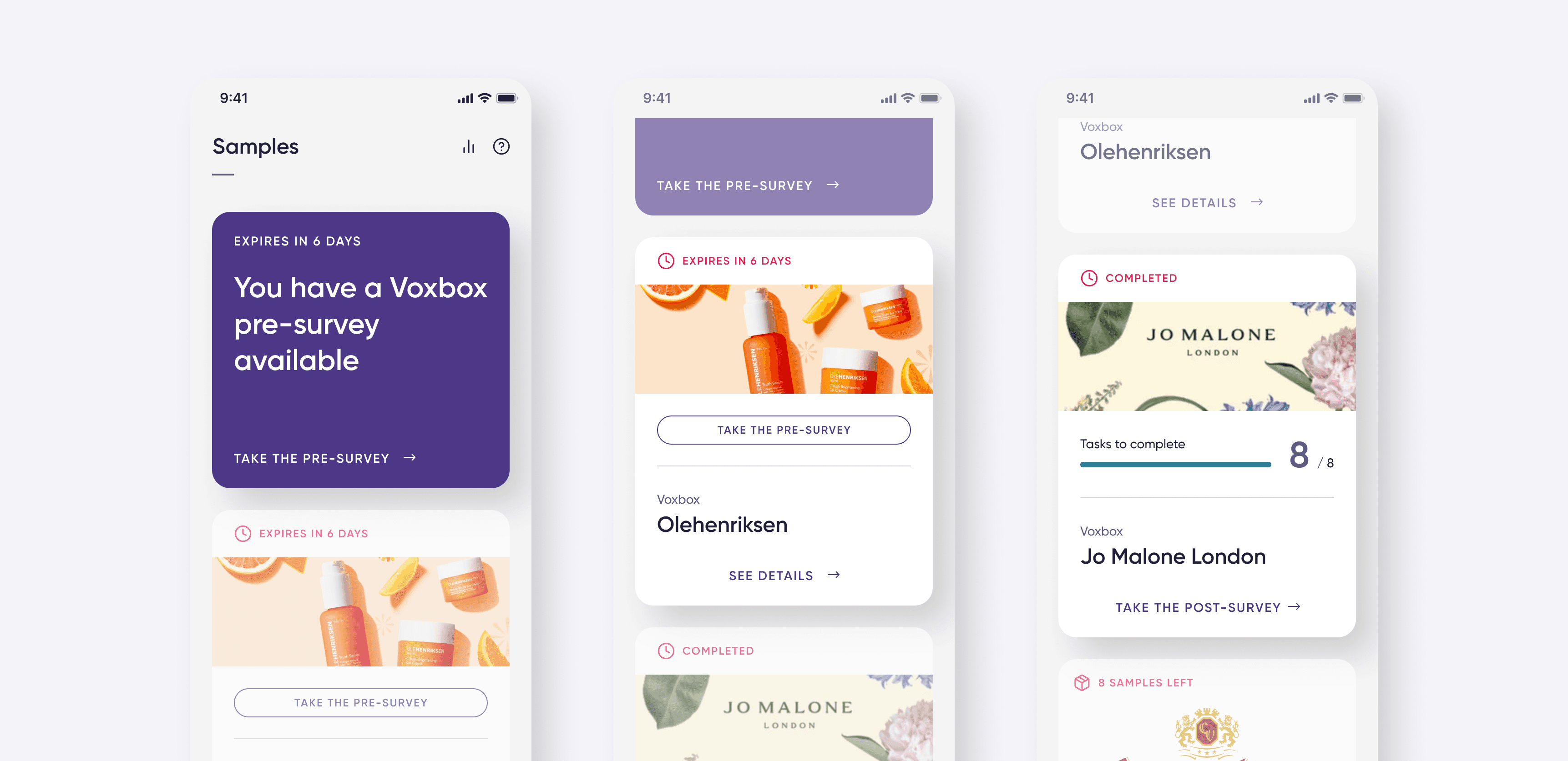
With these changes, most users will now see upcoming campaigns on this screen, drumming up motivation to increase overall engagement with the app.
We also improved the pre-campaign experience by amending the "pre-survey" process. Influenster needs to ask users some questions to ensure they are an ideal candidate. Previously, these surveys often asked users questions about themselves that they had already answered via profile-building mechanisms.
We adjusted the way the app works so that they never have to re-input any data.

Once they are officially selected for a campaign, Influenster sends the user a box of the campaign's free samples (called a "Voxbox"). They then have a few weeks to complete a group of tasks assigned to them. These tasks vary by campaign, but usually consist of writing reviews on various platforms and posting content about the product(s) on their social media accounts.
There are four different types of campaigns, all with different UI needs. We needed all four campaign templates to be straightforward, easy, and instructive, so that Influenster's users generate high-quality content for the companies brand partners.

Search
Since Influenster has a lot going on in general — product reviews, social connectivity, brand-following, product discovery — it was crucial that we created a robust (and intelligent) search functionality so users could find their way.

First, we saw an opportunity for search to be more than just a transactional space, but one that generates user engagement, much like the search page on Instagram.
This space also allows users to browse instead of searching something specific, which is helpful on a platform that asks users to bring to mind random items they've used so they can review them. Being able to browse by category is likewise useful for a platform that aspires to somewhere people can seek product recommendations.

As a user searches, they are met by suggested terms, and after finalizing a search term, the results page makes an assumption about whether the user is looking for a product, a brand, a Q&A discussion, or a person, defaulting to the most relevant tab.

In case the app made the wrong assumption, users can switch to other tabs to search the term across all buckets.
As in the above case, a user searching "headphones" sees companies who make headphones in the Brands tab; discussions involving headphones in the Q&A tab; and users who have left popular reviews or are active in discussions around headphones in the People tab.
User Profile
Influenster has a large social media component to it, and User Profiles are a cornerstone to any social media platform.
On Influenster, the User Profile serves as an anchor point and hub for the many ways people interact with the app — serving as a repository for the content they've created, products and brands they've favorited, access point for followers and people they follow, and tracking badges they've earned.

In the Activity tab, users can access and manage reviews they've written, discussions they've participated in, photos and videos they've uploaded, and brands and products they've favorited.

Badging is a big deal on Influenster, as users earn clout via badges based on their activity within the app. Here, users can view and manages the badges they've earned and are on the way to earning.

While we learn a lot about Influenster during Onboarding and then throughout their time interacting with the app, we still needed a way to capture some "boring" (yet important) and some super-niche information.
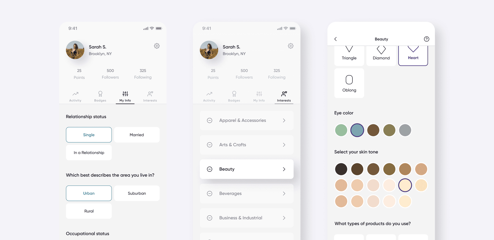
We created two tabs on the User Profile to capture this information. The My Info tab asks for basic demographic information that's important to the company's brand partners, while the Interests tab asks questions that will allow greatly allow us to serve users more personalized content, especially in terms of showing them recommended products.